
Update: after fiddling with this post for way too long I decided to break it up into multiple time-series posts…I thought I could fire off a quick practitioner’s guide to time-series but I was wrong. I have neither the skills nor inclination to write a time-series textbook, but at the other extreme, there are enough hand-wavy time-series vignettes on the internet. I figure if I’m gonna do this, I might as well strive for some measure of completeness.
Here is my general motivating interest in the topic: how can I model a process I suspect is seasonal and test whether a particular policy implemented at some point in the time-series changed the pattern of seasonality?
Before I waste any more of your time, let me tell you exactly what I want to work up to over the next few posts. I’m going to walk through two related but separable approaches to investigating changes in seasonality of a time-series:
1. An approach based on the work of Bai and Perron (1989, 2003, 2005) for developing structural change tests when the number and location of breakpoints is unknown, and
2. An approach based on Hamilton’s (1989) Markov Regime Switching Regression model as implemented in the R package ‘MSwM.’
Here’s the outline:
I. Who cares about this?
II. Simulated data characterization of the time-series properties
III. Two models
A. Markov Regime Switching Seasonal Regression
B. Seasonal dummy variable regression with breakpoint detection
IV. Some related time-series topics that I hope to follow up with
This post will try to cover item I and II.
OK, on with it!
There are some quants who’s knowledge of time-series methods is truly terrifying. I am not one of those people. I’d estimate I know (i) a lot more about time-series methods than your average Data Scientists (but let’s be honest, “Data Scientist” has kind of become code for text classification & NLP button pusher), (ii) a lot less than your average empirical macro-economists, and (iii) about as much as your average quantitative micro-economist (maybe slightly more since, these days, there seems to be a bias in this group towards cute little Levitt-type ‘natural experiments’).
How can I model a process I suspect is seasonal and test whether a particular policy implemented at some point in the time-series changed the pattern of seasonality? This is a complicated question because (1) ‘change in the seasonal pattern’ could mean a lot of things and (2) dynamics are just hard…especially when dealing with human behavior because there’s a lot of shit that can cause your data to move around and you need to figure out how to control for it if you want to isolate the impact of a specific policy. This is a much bigger topic then I’m capable of addressing probably at all but certainly within a single post. I’m going to make every effort to follow this up with a few more time-series posts but for now, I’ll try to break off a manageable chunk of the stochastic seasonality and structural breaks world.
I. Who Cares About This?
People who care about predicting things well seem to care about Regime Switching Models…there are lots of applications in this camp but I kind of liked this paper on using Markov Regime Shift Models for hedging commodity market positions.
People like me who care about measuring the impacts of public policy choices care a lot about models of structural change because we generally want to know whether some process was fundamentally altered by a regulatory action. There’s a neat analysis I read recently on seasonality of tourism in New Zealand. Apparently the government had undertaken some strategy to smooth out seasonality in this economically important industry…the authors were testing whether it worked.
Along the same lines as policy impact analysis, business analytics folks – to the extent that they care about better understanding the success of their business – might care about (i) knowing whether consumer demand for products in their sector exhibit different seasonal patterns at different points in the business cycle. Canova and Ghysels> found that demand for consumer durables exhibits different patterns of seasonality depending on the phase of the business cycle.
II. Simulated Data and Time-Series Properties
To try and better understand some of the popular time-series methods, I created two time-series of monthly observations with the following properties:
1. the first time-series went from having no seasonality for the first 6 years (72 observations) and exhibited seasonal summer peaks in the last 4 years. More specifically, I generated 72 random observations ~ N(1000,4). This produces a series with monthly means of around 1000 and annual means of around 12,000 each year. For the last four years of the series I took 25% of that 12,000 and split it evenly among the 9 months (jan – may and sept – december), roughly 333 1/3 each month and generated a little noise around these levels with random variables ~ N(333.33334, 1.2). The remaining 75% of 12,000 I apportioned to the months june-august, about 3,000 lbs per month, and I generated noise around these observations with monthly levels ~ N(3000,12). I stuck these two series together so that I had a single time series with a notable break between the 72nd and 73 observation.
2. the second time-series I wanted to make a little more complicated but not much. I created data with a break similar to the series in (1) but allowed there to be seasonality in both parts of the time-series. Here I set the annual total to be 12,000 and I set mean monthly shares of the total to be different before and after the break (the actual shares are in the code below). From the total and mean monthly shares I created mean monthly totals then I generate some noise around those monthly totals.
#SERIES 1
year <- c(rep(2005,12),rep(2006,12),rep(2007,12),rep(2008,12),rep(2009,12),rep(2010,12))
month <- c(rep(1:12,6))
y <- rnorm(72,1000,4)
df <- data.frame(year=year,month=month,lbs=y)

#4 years worth of visits that are evenly distributed throughout
# 9 months and spike up considerably in the months June-August
year2 <- c(rep(2011,12),rep(2012,12),rep(2013,12),rep(2014,12))
month2 <- c(rep(1:12,4))

#9 month X 4 years of data distributed N(333.333,0.666)
month1 <- data.frame(lbs=c(rnorm(36,333.333,1.2)),month=rep(c(1,2,3,4,5,9,10,11,12),4),
                    year=c(rep(2011,9),rep(2012,9),rep(2013,9),rep(2014,9)))

#3 months X 4 years of data distributed N(3000,6)
month2 <- data.frame(lbs=c(rnorm(12,3000,12)),month=rep(c(6,7,8),4),
                     year=c(rep(2011,3),rep(2012,3),rep(2013,3),rep(2014,3)))
df2 <- data.frame(rbind(month1,month2))

z <- tbl_df(rbind(df,df2))

#SERIES 2
#next is a series that is seasonal in nature in both periods but
# there is an abrupt shift in the intensity of seasonality after the
# 6th year

year <- c(rep(2005,12),rep(2006,12),rep(2007,12),rep(2008,12),rep(2009,12),rep(2010,12))
month <- c(rep(1:12,6))

y <- data.frame(year=year,month=month)

total.lbs <- 12000
mean.shares <- c(0.02,0.03,0.04,0.05,0.05,0.06,0.15,0.2,0.20,0.1,0.05,0.05)
mean.lbs <- mean.shares*total.lbs

df <- rbind(data.frame(year=c(2005:2010),month=1,lbs=rnorm(6,mean.lbs[1],mean.lbs[1]/100)),
            data.frame(year=c(2005:2010),month=2,lbs=rnorm(6,mean.lbs[2],mean.lbs[2]/100)),
            data.frame(year=c(2005:2010),month=3,lbs=rnorm(6,mean.lbs[3],mean.lbs[3]/100)),
            data.frame(year=c(2005:2010),month=4,lbs=rnorm(6,mean.lbs[4],mean.lbs[4]/100)),
            data.frame(year=c(2005:2010),month=5,lbs=rnorm(6,mean.lbs[5],mean.lbs[5]/100)),
            data.frame(year=c(2005:2010),month=6,lbs=rnorm(6,mean.lbs[6],mean.lbs[6]/100)),
            data.frame(year=c(2005:2010),month=7,lbs=rnorm(6,mean.lbs[7],mean.lbs[7]/100)),
            data.frame(year=c(2005:2010),month=8,lbs=rnorm(6,mean.lbs[8],mean.lbs[8]/100)),
            data.frame(year=c(2005:2010),month=9,lbs=rnorm(6,mean.lbs[9],mean.lbs[9]/100)),
            data.frame(year=c(2005:2010),month=10,lbs=rnorm(6,mean.lbs[10],mean.lbs[10]/100)),
            data.frame(year=c(2005:2010),month=11,lbs=rnorm(6,mean.lbs[11],mean.lbs[11]/100)),
            data.frame(year=c(2005:2010),month=12,lbs=rnorm(6,mean.lbs[12],mean.lbs[12]/100))

y <- merge(y,df,by=c('year','month'))

ggplot(y,aes(x=date,y=lbs)) + geom_line()

#Now change the process abruptly
mean.shares2 <- c(0.01,0.01,0.02,0.02,0.02,0.05,0.1,0.2,0.30,0.2,0.05,0.02)
mean.lbs2 <- mean.shares2*total.lbs
df <- rbind(data.frame(year=c(2011:2014),month=1,lbs=rnorm(4,mean.lbs2[1],mean.lbs2[1]/100)),
            data.frame(year=c(2011:2014),month=2,lbs=rnorm(4,mean.lbs2[2],mean.lbs2[2]/100)),
            data.frame(year=c(2011:2014),month=3,lbs=rnorm(4,mean.lbs2[3],mean.lbs2[3]/100)),
            data.frame(year=c(2011:2014),month=4,lbs=rnorm(4,mean.lbs2[4],mean.lbs2[4]/100)),
            data.frame(year=c(2011:2014),month=5,lbs=rnorm(4,mean.lbs2[5],mean.lbs2[5]/100)),
            data.frame(year=c(2011:2014),month=6,lbs=rnorm(4,mean.lbs2[6],mean.lbs2[6]/100)),
            data.frame(year=c(2011:2014),month=7,lbs=rnorm(4,mean.lbs2[7],mean.lbs2[7]/100)),
            data.frame(year=c(2011:2014),month=8,lbs=rnorm(4,mean.lbs2[8],mean.lbs2[8]/100)),
            data.frame(year=c(2011:2014),month=9,lbs=rnorm(4,mean.lbs2[9],mean.lbs2[9]/100)),
            data.frame(year=c(2011:2014),month=10,lbs=rnorm(4,mean.lbs2[10],mean.lbs2[10]/100)),
            data.frame(year=c(2011:2014),month=11,lbs=rnorm(4,mean.lbs2[11],mean.lbs2[11]/100)),
            data.frame(year=c(2011:2014),month=12,lbs=rnorm(4,mean.lbs2[12],mean.lbs2[12]/100))
)

y2 <- data.frame(month=c(rep(1:12,4)),year=c(rep(2011,12),rep(2012,12),rep(2013,12),rep(2014,12)))
y2 <- merge(y2,df,by=c('year','month'))

z2 <- tbl_df(rbind(y,y2))
Time Series Properties
There are 3 general issues, the characterization of which, most time-series dudes would agree should be your first step in dealing with time-series data:
1. Stationarity
2. Seasonality
3. Autocorrelation structure
I’m about to be pretty hand-wavy about this but these are not things that should be taken lightly. In my opinion too many people are looking for easy answers to the question “how do I test for stationarity?” and too many websites are happy to oblige.
Stationarity in it’s strictest sense means that the statistical properties of the data do not change over time. It seems to be widely accepted that, for most economic applications, weak-stationarity (or covariance stationarity) is ok. Covariance stationarity in words says that the series should have (i) finite variance, (ii) a constant mean, and (iii) and autocovariance function that only depends on the distance between two observations in the series and not the locations of those observations…stated compactly it means:
![E[Y_{t}] = \mu, E[(Y_{t}-\mu)(Y_{t-j}-\mu)]=\gamma_j](https://s0.wp.com/latex.php?latex=E%5BY_%7Bt%7D%5D+%3D+%5Cmu%2C+E%5B%28Y_%7Bt%7D-%5Cmu%29%28Y_%7Bt-j%7D-%5Cmu%29%5D%3D%5Cgamma_j+&bg=%23ffffff&fg=%23111111&s=0&c=20201002)
if these relationships hold for all t and any j then we usually say the series is stationary.
********************************************************************************
A quick digression here: I still have trouble immediately visualizing some of these concepts I my head. Anytime I step away from time-series analysis for more than a day or two I often have to go back and draw some elementary pictures to remind myself what some of these terms mean.
Here’s an illustration of some popular processes:
#stationary AR(1) process
set.seed(1)
x <- w <- rnorm(1000)
for (t in 2:1000) x[t] <- (x[t-1]*0.25)+w[t]

#a trend stationary process
set.seed(1)
x.trend <- w.trend <- rnorm(1000)
for (t in 2:1000)x.trend[t] <- (x.trend[t-1]*0.25)+w.trend[t] + 0.01*t

#a random walk
set.seed(1)
y <- z <- rnorm(1000)
for (t in 2:1000)y[t] <- (y[t-1])+z[t]

#a random walk with drift
set.seed(1)
rwd <- rw <- rnorm(1000)
for (t in 2:1000)rwd[t] <- (rwd[t-1])+rw[t]+0.05

example <- data.frame(rbind(data.frame(t=c(1:1000),x=x,type="AR(1) stationary"),
                            data.frame(t=c(1:1000),x=y,type="Random Walk"),
                            data.frame(t=c(1:1000),x=x.trend,type="Trend Stationary"),
                            data.frame(t=c(1:1000),x=rwd,type="Random Walk with Drift")))

ggplot(example,aes(x=t,y=x)) + geom_line() + facet_wrap(~type,scales="free")
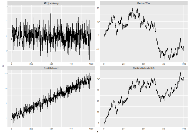
In the top left panel we see a series that looks like it basically ocillates around a constant mean value. In the bottom left panel I added a trend to this series and it appears to oscillate around a pretty clear trend line. In the top right we have the classical example of a non-stationary series: the random walk. In the bottom right we have a random walk with a drift term.
In intellectual terms, as opposed to purely statistical ones, the reason time-series economists tend to be obsessed with stationarity can be seen by comparing the trend stationary series to the random walk with drift series. In the trend stationary example, there are random fluctuations around a trend line: the series can move away from that trend line but always tends to move back toward it eventually.
Compare that the random walk with drift and focus on the observations from t=0 to around t= 125. It kinda looks like the series might be moving around some kind of upward sloping line…but once a random shock moves the series away from that imaginary line (around t=125) it never moves back toward that same line (the series does appear to be generally upward sloping from t~125:t~350…but in that window it kind of looks to me to follow lines with at least 3 very different slopes).
******************************************************************************
This discussion gets a bit funky if we look at the plot of the two series I generated above and consider the following ad-hoc and more formal test for stationarity:
#first a ghetto test of constant mean

# a function to test for equality of means calculated over different windows
# of the time-series. t-test is Welch's two sample, unequal variance t-test
s1 <- z[which(z$series==1),]
welch.t <- function(i,n){
  x <- s1$lbs[i[1]:n[1]]
  y <- s1$lbs[i[2]:n[2]]
    welch.t <- (mean(x)-mean(y))/(sqrt((var(x)/length(x))+(var(y)/length(y))))
 return(data.frame(xbar=mean(x),ybar=mean(y),welch.t=welch.t,xstart=s1$date[i[1]],
                    xend=s1$date[n[1]],ystart=s1$date[i[2]],yend=s1$date[n[2]]))

}

yrs.even <- data.frame(start=c(1,12,72),end=c(120,48,96))
yrs <- data.frame(start=c(48,1,1,15,15,15,78,111),end=c(120,41,77,120,31,88,81,120))

meanstest <- list()
counter=0
for(k in 1:nrow(yrs.even)){
  for(l in 1:nrow(yrs.even)){
    counter= counter+1
  meanstest[[counter]]<-  welch.t(i=c(yrs.even$start[k],yrs.even$start[l]),
                                  n=c(yrs.even$end[k],yrs.even$end[l]))
}
}
> meanstest
[[7]]
xbar         ybar    welch.t xstart     xend        ystart     yend
1 998.8479 2329.744 -1.972462 2008-12-01 2014-12-01 2011-06-01 2011-09-01

[[8]]
xbar ybar welch.t xstart xend ystart yend
1 998.8479 1133.178 -0.318442 2008-12-01 2014-12-01 2014-03-01 2014-12-01

[[9]]
xbar ybar welch.t xstart xend ystart yend
1 999.7374 998.8479 0.008063565 2005-01-01 2008-05-01 2008-12-01 2014-12-01

[[10]]
xbar ybar welch.t xstart xend ystart yend
1 999.7374 999.7374 0 2005-01-01 2008-05-01 2005-01-01 2008-05-01
I only printed off a couple rows of the window-by-window comparison of means but, considering the critical value for 
This is all well and good when we consider only windows that are multiples of 12 but, since this series is seasonal, if we calculate the mean over windows the stop or start mid year we could get some funky results. For instance, if we calculate the mean from 
If I change the “yrs.even” vector in the loop above to “yrs” we get some statistically different mean values for the series as illustrated below:
yrs <- data.frame(start=c(48,1,1,15,15,15,78,111),end=c(120,41,77,120,31,88,81,120))
meanstest <- list()
counter=0
for(k in 1:nrow(yrs)){
for(l in 1:nrow(yrs)){
counter= counter+1
meanstest[[counter]]<- welch.t(i=c(yrs$start[k],yrs$start[l]),
n=c(yrs$end[k],yrs$end[l]))
}
}
#plot the series along with some paired windows for which the mean is not statistically
# different along with some for which it is.
meanstest <- data.frame(rbindlist(meanstest))
plot.tmp <- meanstest[49,]
s1$t <- seq(1:nrow(s1))
#this is pretty contrived but since I know the 48th element of the
# "meanstest" object test for a significant difference between the
# mean of the series calculated from 2011/06/01-2011/08/01 and
# from 2008/01/01-2014/01/01, I'm just going to pull that element out
# and illustrate the different means.
# Also note, this won't generalize well since the data are random draws
# but it suits the current purpose.
ggplot(subset(s1,year<2007),aes(x=as.numeric(t),y=lbs)) + geom_line() +
xlab("t") + ylab("fake data") +
geom_segment(aes(x = 78, y = 2000, xend = 81, yend = 2000,
colour = "segment"),data = plot.tmp,
arrow = arrow(length = unit(0.03, "npc"))) +
geom_segment(aes(x = 48, y = 2500, xend = 120, yend = 2500,
colour = "segment",lineend='square'), data = plot.tmp,
arrow = arrow(length = unit(0.03, "npc"))) +
annotate("text",x=70,y=2000,
label=as.character(expression(~mu==2327)),parse=T) +
annotate("text",x=42,y=2500,
label=as.character(expression(~mu==998)),parse=T) +
scale_color_discrete(guide=FALSE)
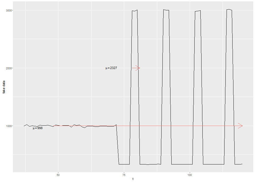
I called that my ghetto test because it is pretty ad-hoc. We could use something more formal like an Augmented Dickey-Fuller Test or the KPSS (Kwiatkowski-Phillips-Schmidt-Shin…Kwiatkowski? Isn’t that one of them penguins from Madagascar?).
The Augmented Dickey Fuller test (ADF) for data that are slow turning around a non-zero mean value is conducted by running the auxiliary regression:

The number of lags (p) to include is generally found by minimizing the Schwartz Bayesian information criterion. For a test of trend stationarity a time trend can be added to the equation above. ADF tests the null hypothesis that 
These tests can be carried out in R using functions from the tseries package:
require(tseries)
#test a null hypothesis of level stationarity...first leave the "k" argument blank and let the function
# choose the optimal lag order
adf.test(z$lbs[which(z$series==1)])

	Augmented Dickey-Fuller Test

data:  z$lbs[which(z$series == 1)]
Dickey-Fuller = -6.8329, Lag order = 4, p-value = 0.01
alternative hypothesis: stationary

# now tell it how many lags to include
adf.test(z$lbs[which(z$series==1)],k=12)
	Augmented Dickey-Fuller Test

data:  z$lbs[which(z$series == 1)]
Dickey-Fuller = -5.8633, Lag order = 12, p-value = 0.01
alternative hypothesis: stationary

# run the KPSS test...note KPSS doesn't accept an argument for lag order
kpss.test(z$lbs[which(z$series==1)])

KPSS Test for Level Stationarity

data:  z$lbs[which(z$series == 1)]
KPSS Level = 0.011696, Truncation lag parameter = 2, p-value = 0.1

Warning message:
In kpss.test(z$lbs[which(z$series == 1)], null = "Trend") :
  p-value greater than printed p-value

# the function can be used with options to test level stationarity and trend stationarity
kpss.test(z$lbs[which(z$series==1)],null="Trend")

	KPSS Test for Trend Stationarity

data:  z$lbs[which(z$series == 1)]
KPSS Trend = 0.011504, Truncation lag parameter = 2, p-value = 0.1
It is worth paying some attention to the warning message produced by the kpss.test function. The function will only return p-value between 0.01 and 0.1. A value of 0.1 is interpreted as a lack of evidence against the null hypothesis of stationarity.
Here’s a little nugget from my experience: non-stationarity can really jack you up if you are primarily concerned with prediction. Since I am concerned more with ex-post policy analysis and the nature of non-stationarity in my data, I’m not super concerned with correcting the series for stationarity. As a good empiricist I will probably estimate all of my models a few different times using first differences, log differences, and seasonal differences just to be sure I’m getting things right.
Seasonality
One’s approach to seasonality seems to me to depend a lot on what discipline one is approaching time-series from. For example, some economists are very interested in long-run trends in variables measured over long periods of time. For this group, seasonality in things like employment (there are more construction jobs in the summer than winter) or retail sales (people tend to sell more shit around Christmas) can tend to obscure long-term trends. This group often wants to remove seasonality from a series in order to isolate trends. Other people may be explicitly interested in forecasting short-run changes in things like exchange-rates or spot freight rates for oil tankers. This group might be more interested in understanding seasonality and incorporating it into models.
Sometimes seasonality can be obvious: you plot some data collected on monthly intervals over several years and each month within a year looks different but the same month over multiple years looks the same. Sometimes it’s not so obvious. In the latter case we’d really like to have a test that could suggest to us, based on the properties of the data, what the seasonality is…if any.
Two test-like things that get a lot of play in the time-series literature are correlograms and periodograms. I’ve never been very good at interpreting correlograms so I’ll play with the periodogram here. The periodogram is the result of a popular procedure in time-series: take a complicated thing, try to decompose it into the sum of simpler parts and study those parts:
With a time-series of length 


![x(t)-\overline{x}=\sum_{k=2}^{n/2+1}\gamma_{k}[a_{k}cos(2\pi(t-1)w_{k}) + b_{k}sin(2\pi(t-1)w_k)]](https://s0.wp.com/latex.php?latex=x%28t%29-%5Coverline%7Bx%7D%3D%5Csum_%7Bk%3D2%7D%5E%7Bn%2F2%2B1%7D%5Cgamma_%7Bk%7D%5Ba_%7Bk%7Dcos%282%5Cpi%28t-1%29w_%7Bk%7D%29+%2B+b_%7Bk%7Dsin%282%5Cpi%28t-1%29w_k%29%5D+&bg=%23ffffff&fg=%23111111&s=0&c=20201002)


Here a and b are the real and imaginary parts of the discrete Fourier transform of the data 

The last couple pieces are this:
let


Finally, the plot of 

This is one of those things that’s kind of like Chebyshev Polynomial Approximation that looks way gnarlier than it actually is. Also, most stats packages will have some way to plot spectral density of a time-series. In my case:
#plot the periodogram of the second series (since that is the one with seasonality throughout)...
  # also, start by just plotting the series prior to the structural break
spec <- spec.pgram(z$lbs[which(z$series==2)][1:72],log='yes')
ggplot(data.frame(freq=spec$freq,spec=spec$spec),aes(x=freq,y=spec)) +
geom_line() + theme_bw() + ggtitle('Periodogram of Monthly Fake Data')

#identify the period of the first spike (location and period)
1/spec$freq[which(spec$spec==max(spec$spec))])
Will plot the periodogram of the second series (the one with some seasonality in all parts of the time-series), producing this little guy:

If this were real-life data I suspect the periodogram wouldn’t be quite so clean, and in fact if we repeat this little experiment for the first series we get some pretty ambiguous results. Nonetheless, the periodogram can sometimes be a nice tool for assessing whether your data have seasonal properties. Similar to autocorrelation functions and partial autocorrelation functions, the periodogram will generally have a spike at the frequency corresponding to the period of seasonality in the data.
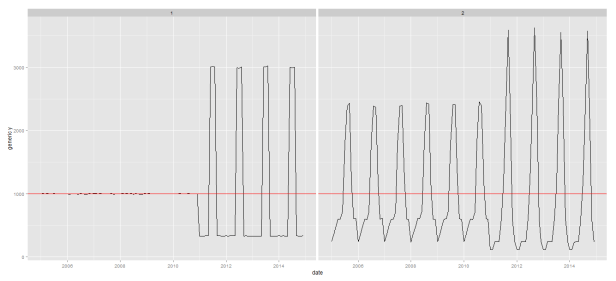
A slightly less intense approach, that has the dual attractive feature of providing an eyeball test about possible structural breaks is just to plot the monthly series. This is one of the approaches suggested by Canova and Ghysels.
#plot the seasonal series
ggplot(z,aes(x=factor(year),y=lbs,group=factor(month),color=factor(month))) + geom_line() + facet_wrap(~series) +
  xlab("year") + ylab("fake time-series data")
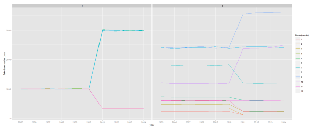
This gives up a pretty good indication that (i) there are no apparent seasonal differences in the first series before 2011, (ii) there appears to be a pretty big divergence in seasonal values beginning in 2011, (iii) there appear to important seasonal differences in the entire time-series for series 2, and (iv) some of these seasonal differences appear to have changed notably after 2010.
I think I’m going to stop here for now. I wanted to get to autocorrelation in this post but that’s going to have to be a topic for another day. If this post generates some comments I might come back and do some editing to clean up some of the more hand-wavy items.
later,
mams
