
I just finished an exhilarating 1.5 day long meeting on database structures and I’m sitting in the Portland Airport drinking quality Oregon beer at the Rogue taproom in the PDX D Terminal. This seems as good a time as any to blog about functionality I recently discovered for working with World Bank data. The WDI (also check out this GitHub Repo) package for R is baller.
In the past when I’ve worked with World Bank data the process of i) comb the World Bank site for the name of the indicators I want, ii) download separate .csv’s for each indicator, iii) clean the files in R (switch from wide to long format) was more than my patients could bare. Vincent Arel-Bundock’s WDI package is a game changer. It connects to the World Bank’s WDI download API.
Here’s an unsophisticated but still pretty cool example: suppose I want to know whether countries with greater access to education among females experience faster economic growth. PS: I’m not pulling this out of my ass…there’s some pretty interesting proper research on this topic:
First, I can use the WDIsearch function to find the name of the data series to import:
require(ggplot2)
require(WDI)
require(XML)
require(dplyr)

WDIsearch('secondary school',field='indicator')

      indicator              name
 [1,] "BAR.SEC.SCHL.1519"    "average years of secondary schooling, 15-19, total"
 [2,] "BAR.SEC.SCHL.1519.FE" "average years of secondary schooling, 15-19, female"
 [3,] "BAR.SEC.SCHL.15UP"    "average years of secondary schooling, 15+, total"
 [4,] "BAR.SEC.SCHL.15UP.FE" "average years of secondary schooling, 15+, female"

WDIsearch('gdp',field="indicator")
Based on the options returned by the WDIsearch() function, I choose the indicators “BAR.SEC.CMPT.15UP.FE.ZS” (percent of the female population 15 and up completing secondary school) and “NY.GDP.PCAP.KD” (GDP per capita measured in constant year 2000 US dollars). Next, we use the function WDI() to import the data series.
#pull the female education indicator
femsec.df <- WDI(country="all",indicator="BAR.SEC.CMPT.15UP.FE.ZS",start=1960, end=2015)

#for GDP we'll use GDP/capita measured in constant 2000 U.S. $s
gdp <- WDI(country="all",indicator="NY.GDP.PCAP.KD", start=1960,end=2015)

#standardize some field names
names(femsec.df) <- c("iso2c","country","edu","year")
names(gdp) <- c("iso2c","country","gdp_pc","year")
The next thing I’m going to do here is to parse some of the World Bank’s online tables to get a list of individual countries and the World Bank Regions they reside in. I’m confining this analysis to regions containing high densities of developing nations (Sub-Saharan Africa, the Middle East and North Africa, Latin America and the Caribbean, South Asia, East Asia and the Pacific, and Eastern Europe.
#Sub-Saharan Africa
tmp <- readHTMLTable("http://data.worldbank.org/region/SSA")
countries.SSA <- c(as.character(tmp[[1]]$V1),as.character(tmp[[1]]$V2))

#Middle Eastern Countries
tmp <- readHTMLTable("http://data.worldbank.org/region/MNA")
countries.ME <- c(as.character(tmp[[1]]$V1),as.character(tmp[[1]]$V2))


#Eastern Europe and Central Asia
tmp <- readHTMLTable("http://data.worldbank.org/region/ECA")
countries.ECA <- c(as.character(tmp[[1]]$V1),as.character(tmp[[1]]$V2))

#South Asia
tmp <- readHTMLTable("http://data.worldbank.org/region/SAS")
countries.SAS <- c(as.character(tmp[[1]]$V1),as.character(tmp[[1]]$V2))

#Latin American and Carribean
tmp <- readHTMLTable("http://data.worldbank.org/region/LAC")
countries.LAC <- c(as.character(tmp[[1]]$V1),as.character(tmp[[1]]$V2))

#East Asia and Pacific
tmp <- readHTMLTable("http://data.worldbank.org/region/EAP")
countries.EAP <- c(as.character(tmp[[1]]$V1),as.character(tmp[[1]]$V2))

countries <- c(countries.EAP,countries.LAC,countries.SAS,countries.ECA,countries.ME,countries.SSA)
Now we can do some final set up and visualize the data
#convert the data frames to dplyr type objects just to make things easier to look at
femsec.df <- tbl_df(femsec.df)
gdp <- tbl_df(gdp)

#join the education data with the GDP data
df <- left_join(gdp,femsec.df,by=c("iso2c","country","year"))

#now set up a long-run change data frame - calculate change in female educational attainment
# and change in per capita gdp from 1980 to 2005.
df.1980_2005 <- df %>%
      filter(is.na(gdp_pc)==F & is.na(edu)==F & year %in% c(1980,2005) & country %in% countries) %>%
      group_by(iso2c) %>%
      arrange(iso2c,year) %>%
      mutate(gdp_change=log(gdp_pc/lag(gdp_pc))/25,
                    edu_change=log(edu/lag(edu))/25) %>%
      mutate(area = ifelse(country %in% countries.ME,"ME",
                           ifelse(country %in% countries.SAS,"SAS",
                                  ifelse(country %in% countries.SSA,"SSA",
                                         ifelse(country %in% countries.LAC,"LAC","OTH")))))

#First plot two snapshots in time...this avoids the issue of dealing with countries that may have started
# at a high level of female educational attainment
ggplot(df.1980_2005,aes(x=edu,y=gdp_pc)) + geom_point() +
  geom_smooth(method="lm") + xlab("Education") + ylab("GDP") +
  facet_wrap(~year,scales="free")
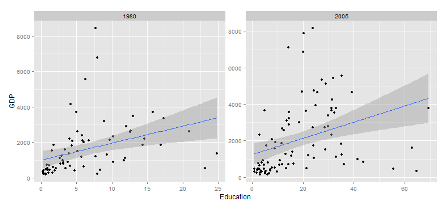
I’m going to skip the step where we run a naive linear model with gdp regressed on female educational attainment because it doesn’t provide any insight over the OLS fit line included in the graphic above. Instead we’ll move straight to a fixed effects model which will control for some of the unobserved but country specific sources of variation. In addition, I’m going to grab one more data series to introduce as a control variable just for fun. The series I’m going to pull is agricultural production as a % of GDP. This will help control for the stylized observation that agriculturally dependent economies tend to grow slower than service driven economies.
#pull the series on ag production as a % of GDP
ag <- WDI(country="all",indicator="NV.AGR.TOTL.ZS",start=1960,end=2010)
names(ag) <- c('iso2c','country','ag','year')
ag <- tbl_df(ag)

#join these new series with the original data on female educational attainment and GDP
df <- left_join(df,ag,by=c("iso2c","country","year"))

#balance the panel
fe <- df %>%
      filter(country %in% countries &
               is.na(edu)==F &
               is.na(gdp_pc)==F &
               #is.na(tech)==F &
               is.na(ag)==F & year %in% c(2005,2010)) %>%
      arrange(country) %>%
      group_by(country) %>%
      mutate(nyrs=n()) %>%
      filter(nyrs==2)

#specify the linear model...by including a dummy variable for each country we control for
# country-specific but time-invariant factors
summary(lm(gdp_pc~edu+ag+factor(country),data=fe))
The results of this ad-hoc analysis suggest that countries that do a better a job of educating females tend to experience higher GDP growth rates. Obviously, this isn’t the level of empirical rigor that one might find in The Journal of Monetary Economics or American Economic Review but, hey, I’m half drunk in an airport eating tater tots…don’t bust my balls.
My point here, dude, is that the World Bank houses hundreds of data series on agricultural production, investment in infrastructure, education, science and technology indicators, etc. These series typically span the years 1960-2015 and include hundreds of countries around the world.
